If you keep to a VW colour the van will look right.
The VW colour catalogue is huge..
Two tone paint is a great look.. but the darker shade must be on the bottom for aesthetic reasons in my opinion...otherwise the van will look top heavy.
using the vans natural swage lines gives it a factory look, forcing swage lines that aren't there on a panel van is a disaaarster (for me).
take my van as it was, way back... in the past
Autosleeper tried to invent lines and it looked wrong
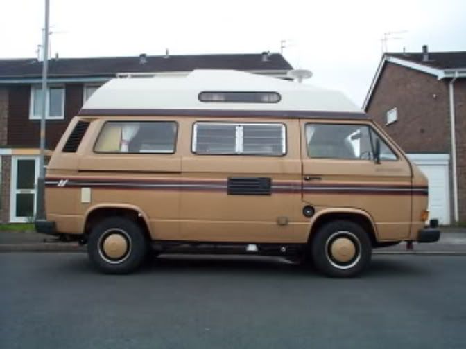
See? the lines are lowering the swage, thinning the van.
the high top being white just makes the whole thing look unconnected... yuk!!
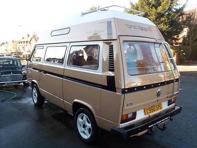
so I changed it, and tried to tie the van and high top together, put back the vans handsome lines.
By
part painting the high top it stopped looking so high and tied it in!
Adding the white to the window lines tied the top to the bottom and enhanced the center lines lifting it slightly
putting a black stripe through the swage and up into the vent further tied the top in and shortened the van.
Finally to balance it all out I gave carol some white socks.
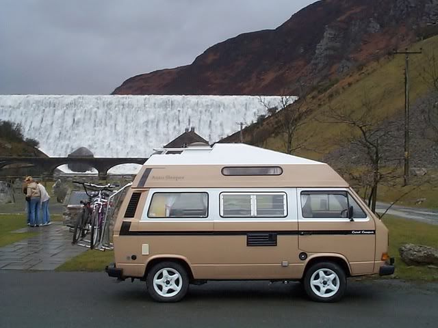
even the back had a little make over, The panel with the plate and lights was enhanced with white.
It's not the best paint design, but it's mine, and it's unique

..I used
photoshop to design it, and handed the picture to the painter... he copied it to the letter... unfortunately too close, he mixed the colour himself to match the photo..which wasn't a VW colour...luckily I liked it.

Sadly as a footnote it all got wiped away during Carols respray and renovation.
Now she's a blank canvass again

AGG 2.0L 8V. (Golf GTi MkIII)